KRAZY SPOON
疯番茄餐厅,前身是KRAZY SPOON(疯狂的勺子),创始于2012年,经历十余年的发展与成长,已然形成自己的品牌性格。充满活力的品牌氛围和绝佳的食物味道,得到一众消费者的认可与喜爱。
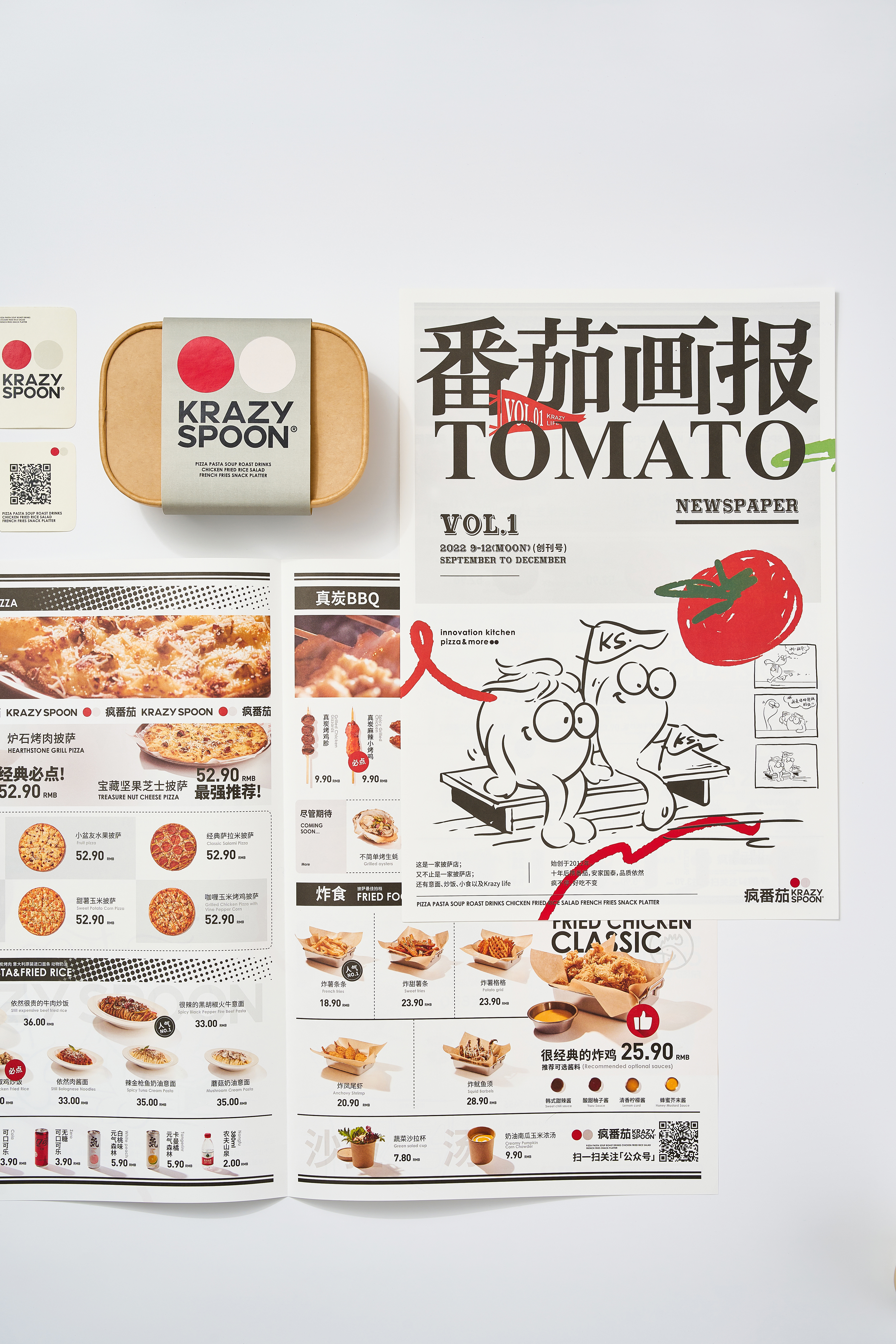
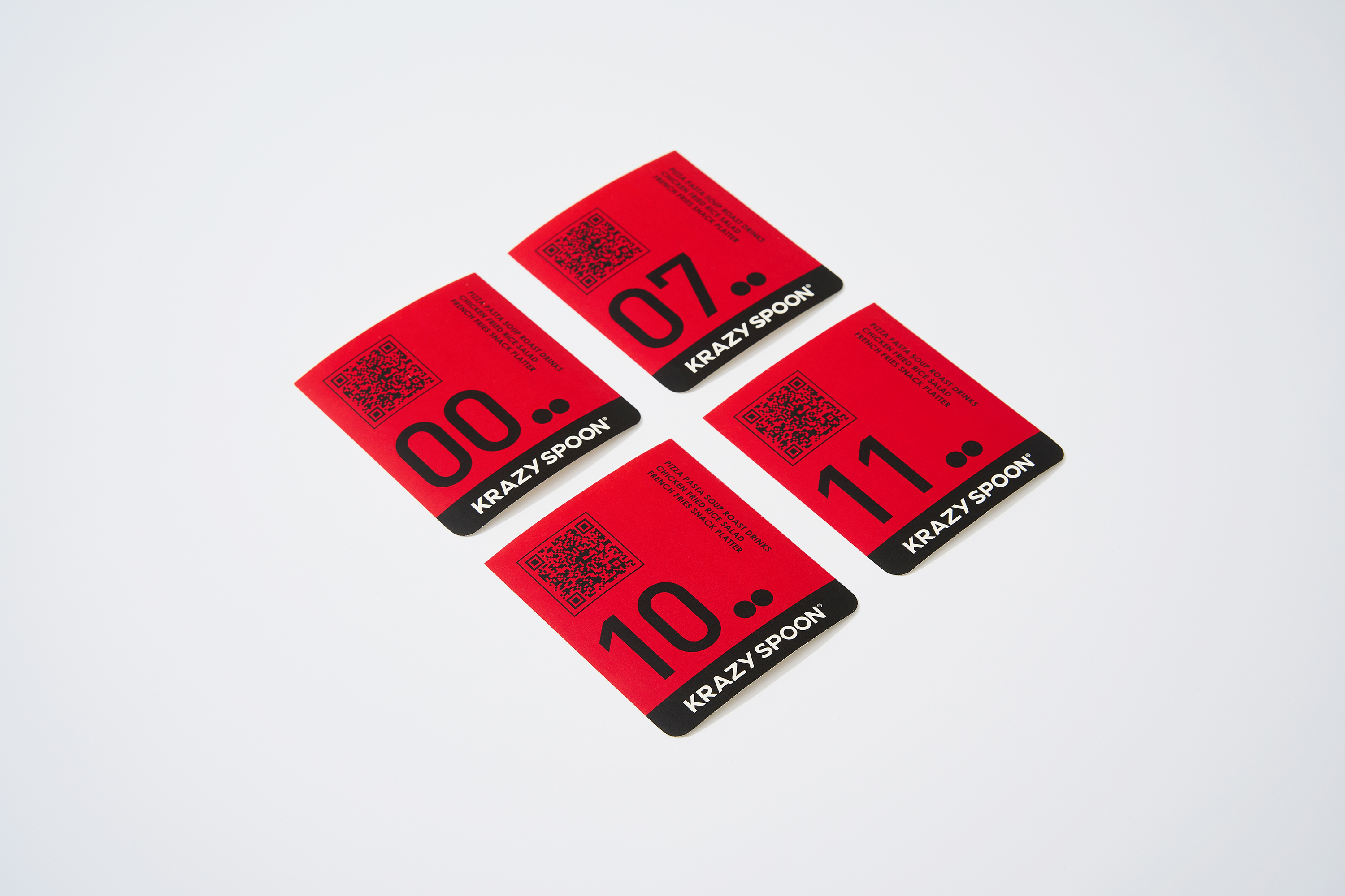
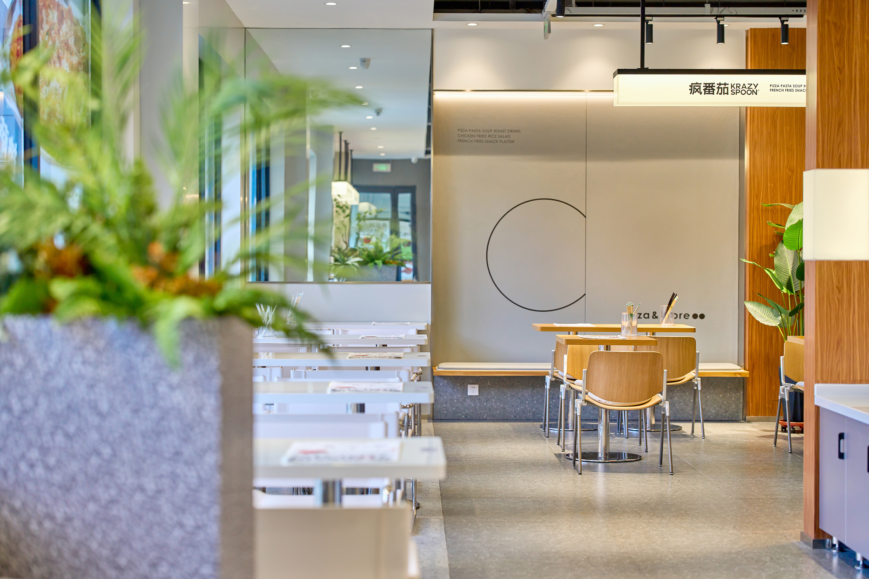
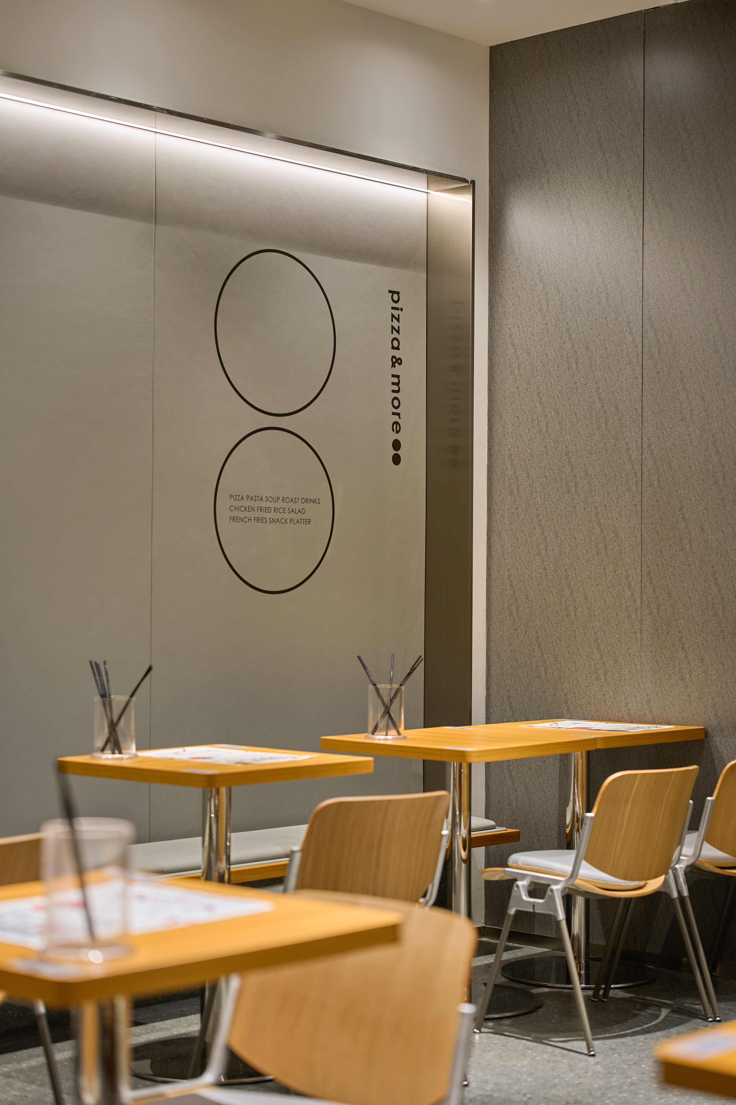
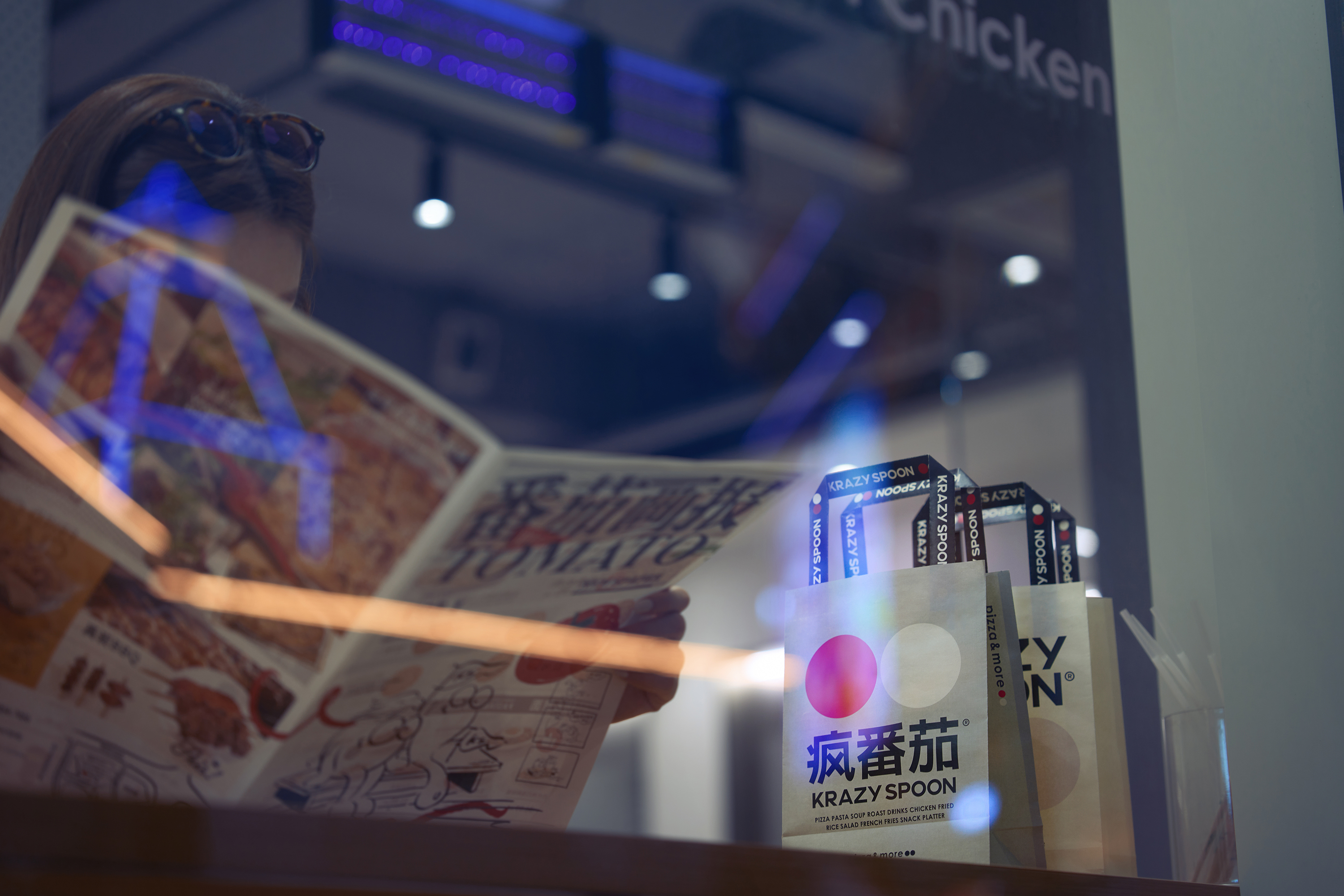
由于中文名称一直未能注册,品牌启用了新的名字“疯番茄”,英文名称依然保留了KRAZY SPOON。已经形成的品牌资产如何留存并转化,新的视觉符号如何被消费者识别记忆,是我们要解决的问题。英文名称的字母大写是品牌发展中一直延续至今的符号,我们在此基础上优化了英文字体,并设计出了相应的中文字体,图形语言上红色圆圈和灰色圆圈代表了番茄和勺子,极简的色彩符号形成极强的辨识度,搭配特定的文字排版,形成了新视觉的识别系统...
由于中文名称一直未能注册,品牌启用了新的名字“疯番茄”,英文名称依然保留了KRAZY SPOON。已经形成的品牌资产如何留存并转化,新的视觉符号如何被消费者识别记忆,是我们要解决的问题。英文名称的字母大写是品牌发展中一直延续至今的符号,我们在此基础上优化了英文字体,并设计出了相应的中文字体,图形语言上红色圆圈和灰色圆圈代表了番茄和勺子,极简的色彩符号形成极强的辨识度,搭配特定的文字排版,形成了新视觉的识别系统...
“疯番茄” -crazy tomato Restaurant, formerly known as Krazy
Spoon-“疯狂的勺子”, was founded in 2012. After more than a
decade of development and growth, it has formed its own brand personality. The
vibrant brand experience and excellent food taste have been recognized and
loved by a large number of consumers.
Due to the inability to register the Chinese identity, the brand has adopted a new name "疯番茄"-crazy tomato, while the English identity remains KRAZY SPOON. How to preserve and transform the inherent brand assets, and how new visual symbols can be recognized and remembered by consumers, are the problems we need to solve. The uppercase letters are symbols that have been used in brand development to this day. Based on this, we have optimized the English font and designed corresponding Chinese fonts. In the graphic language, red and gray circles represent tomatoes and spoons, and the minimalist color symbols form a strong recognition. Coupled with specific text layout, a new visual identity system has been formed…
Due to the inability to register the Chinese identity, the brand has adopted a new name "疯番茄"-crazy tomato, while the English identity remains KRAZY SPOON. How to preserve and transform the inherent brand assets, and how new visual symbols can be recognized and remembered by consumers, are the problems we need to solve. The uppercase letters are symbols that have been used in brand development to this day. Based on this, we have optimized the English font and designed corresponding Chinese fonts. In the graphic language, red and gray circles represent tomatoes and spoons, and the minimalist color symbols form a strong recognition. Coupled with specific text layout, a new visual identity system has been formed…