旺香长
旺香长以“创新川渝味 诚知大众心”的理念传承川味经典,
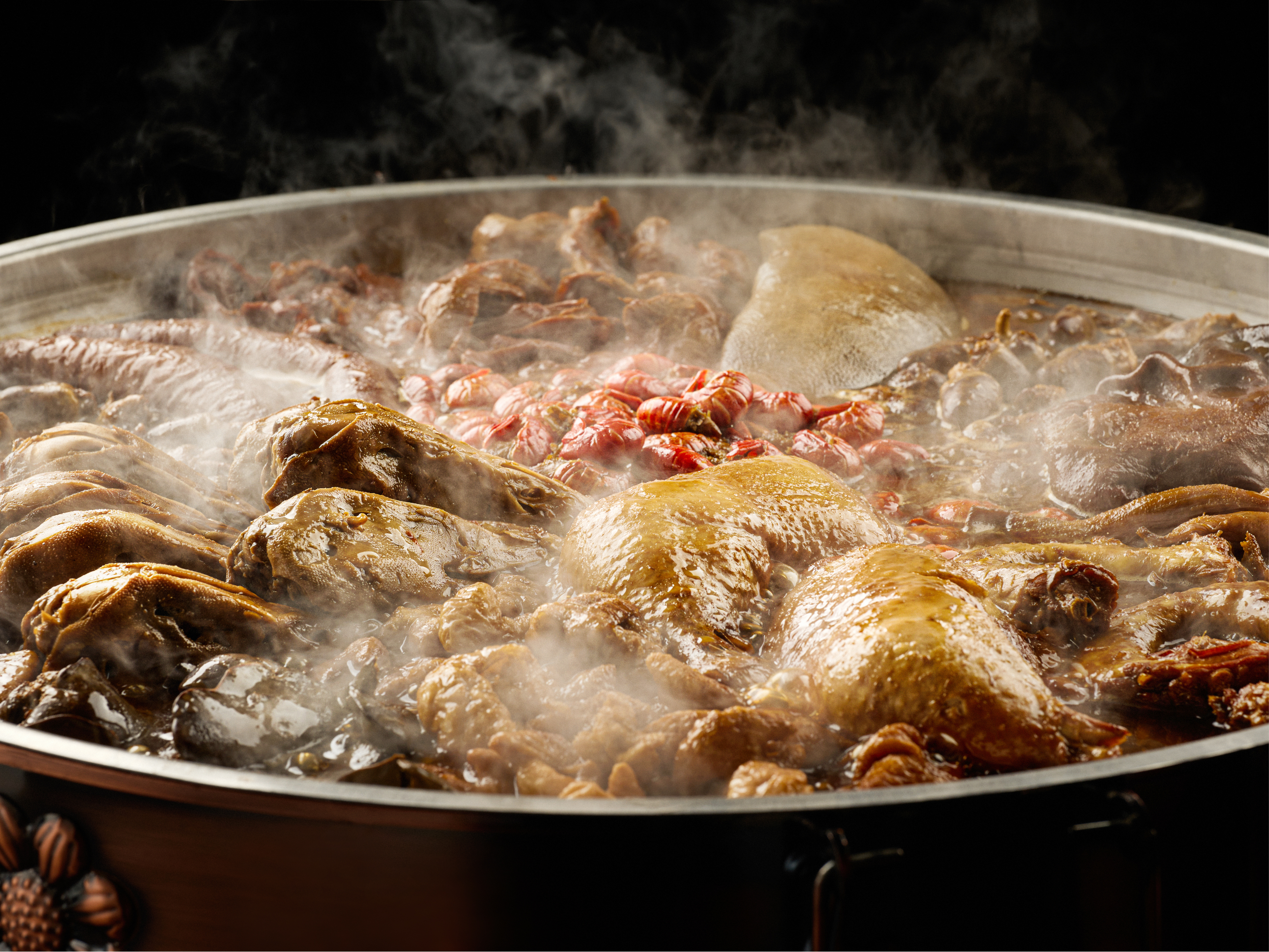
并推陈出新,凭借独创的卤味毛血旺,给热辣增鲜,独具风味,
征服食客味蕾。
品类确定后,“旺香长”被定为品牌名字, 一个人格化的形象也自然被引入了设计体系中。
传承经典并推陈出新,也成为了设计中对于“新”与“旧”, “文化传承”与“美学呈现”的思考。
正楷体榜书——榜书,意指书写大字,是专门为宫殿匾额或门额所写,因其字大醒目,具有很强的视觉冲击力。 正楷书,形体方正,笔画平直,更趋简化,易于识别,作为标识的文字部分的识别字体,会是恰当的选择。 以书法字体的行笔结构作为根基,并在此基础上重新设计字体, 从而达到经典+创新的平衡,并让品牌具有良好的可读性。
品类确定后,“旺香长”被定为品牌名字, 一个人格化的形象也自然被引入了设计体系中。
传承经典并推陈出新,也成为了设计中对于“新”与“旧”, “文化传承”与“美学呈现”的思考。
正楷体榜书——榜书,意指书写大字,是专门为宫殿匾额或门额所写,因其字大醒目,具有很强的视觉冲击力。 正楷书,形体方正,笔画平直,更趋简化,易于识别,作为标识的文字部分的识别字体,会是恰当的选择。 以书法字体的行笔结构作为根基,并在此基础上重新设计字体, 从而达到经典+创新的平衡,并让品牌具有良好的可读性。
mr·wang inherits the classics of Sichuan flavor with the concept of "innovating Sichuan and Chongqing flavors and knowing the hearts of the people".
And bring forth the new through the old, relying on the original braised hairy blood to add freshness to the hotness, with a unique flavor,
Conquer the taste buds of diners.
After the category was determined, "Wangxiangchang" was designated as the brand name,
A personified image is also naturally introduced into the design system.
Inheriting the classics and bringing forth the new through the old has also become the "new" and "old" in the design,
Reflections on "Cultural Inheritance" and "Aesthetic Presentation".
Block script Bangshu——Bangshu, which means writing big characters, is specially written for palace plaques or gates, because of its large and eye-catching characters, it has a strong visual impact.
Regular script, with a square shape and straight strokes, is more simplified and easy to recognize. It will be an appropriate choice for the recognition font of the text part of the logo.
Taking the stroke structure of calligraphy fonts as the foundation, and redesigning the fonts on this basis,
So as to achieve the balance of classic + innovation, and make the brand have good readability.